

Tagging tradition
Price labels & details
Designed for pop-up booths and local markets, the table stand and supporting print materials draw inspiration from traditional Hong Kong street food signage and the visual culture of Hong Kong cha chaan teng. Incorporating elements such as bold typography and classic terrazzo textures, these pieces reinforce the brand’s nostalgic tone while maintaining a clean, modern aesthetic.


Serving the vibe
Menu design
The menu blends the street-style charm of traditional Hong Kong cha chaan teng (茶餐廳) with a contemporary layout, incorporating illustrated icons, a dual-language format, and visual cues inspired by classic terrazzo textures (紙皮石). The menu highlights key items through a bold visual hierarchy and a color palette that reinforces the nostalgic yet modern brand tone.
My works
852 Food Lab
Biting into Nostalgia: Your Go-To
Lab for Authentic Hong Kong Treats
My Role
UI & UX Designer
Brand Designer
Web Developer
Tools
Wix Studio
Photoshop
Canva
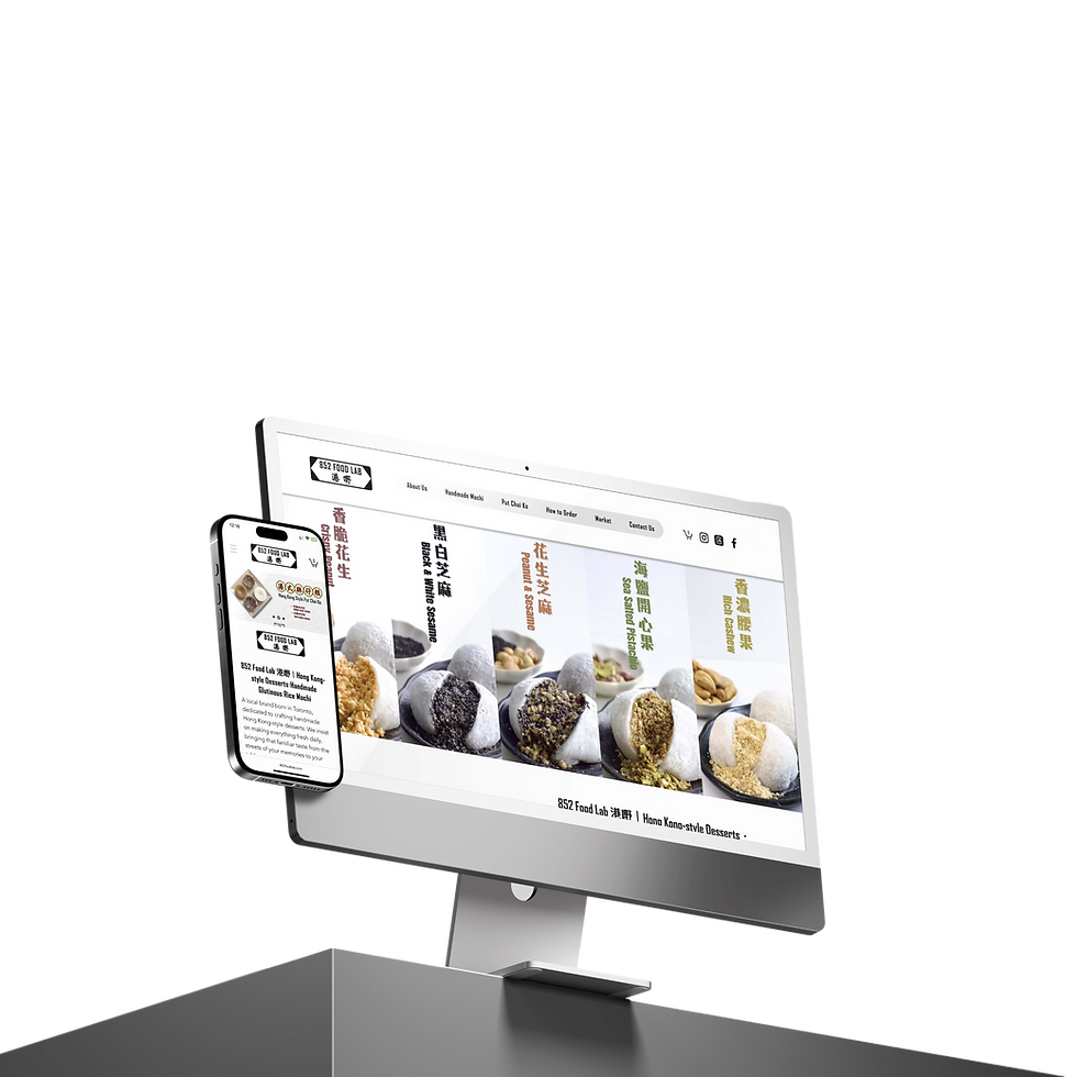
An online shop celebrating the authentic taste of Hong Kong, offering handmade treats and cultural bites that bring nostalgic flavours and heartfelt stories to every corner of Canada.

Problem
Solution
Many Hong Kong immigrants and second-generation Canadians often struggle to find authentic, handmade Hong Kong-style snacks and desserts in Canada. Mainstream options lack the nostalgic flavours and cultural connection that these communities crave, while online alternatives rarely reflect the heart and soul of traditional treats.
852 Food Lab was created to fill this cultural and culinary gap by offering a curated selection of handmade Hong Kong desserts through an easy-to-use online shop. By combining authentic recipes with modern branding and accessible web design, 852 Food Lab brings the taste of "home" to communities across Canada—one bite at a time.
852 Food Lab was founded in 2024 with a mission to bring the authentic taste of Hong Kong to food lovers across Canada. Specializing in handmade, small-batch treats like mochi and traditional desserts, the brand celebrates the rich culinary heritage of 852 through nostalgic flavours and creative twists. With a growing online presence and loyal customer base, 852 Food Lab continues to connect communities through food, offering a delicious bridge between cultures, memories, and modern lifestyles.
Overview
Design
Defining the visual voice
Brand identity & collateral
The 852 Food Lab brand identity draws inspiration from the iconic black-and-white Hong Kong street signs, reflecting the city’s authentic, nostalgic vibe. This classic aesthetic grounds the brand in its cultural roots while offering a timeless, bold look. The logo’s monochrome palette emphasizes simplicity and versatility, making it instantly recognizable across both digital and physical formats.


Popping up online
Social media for market events
To promote 852 Food Lab’s pop-up events, I created a series of social media posts inspired by the traditional Chinese calendar (通勝) — a nostalgic reference familiar to Cantonese-speaking audiences. Each post featured event details such as date, time, and location, styled in a way that mimicked the layout and visual rhythm of classic Chinese almanacs.
By blending heritage-inspired design with modern graphic composition, these posts not only informed followers but also strengthened brand storytelling. The result was a series of eye-catching visuals that stood out on social feeds and reinforced the connection between Hong Kong food culture and local Toronto events.

